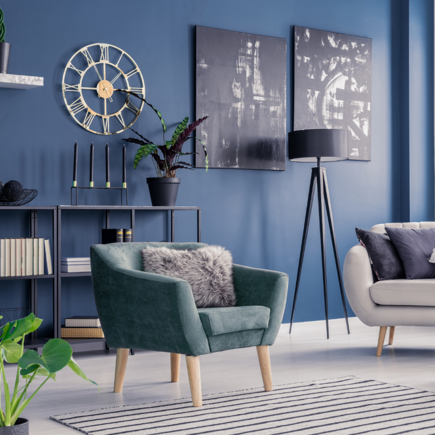


Trending Colors for 2022
Sharon Monticello
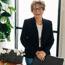
Sharon Monticello is native to one of California's most picturesque areas— Petaluma, nestled in the heart of wine country, has been home to Sharon's...
Sharon Monticello is native to one of California's most picturesque areas— Petaluma, nestled in the heart of wine country, has been home to Sharon's...
It's time to get some air, don't you think? Discover a design landscape steeped in colors that make us feel healthy, serene, and focused. These clarifying blues, delicate greens, and earthy tones awaken the interiors and point us toward a horizon full of optimism.
2022 is right around the corner! And with a new year, comes new trends. A motif, a theme, or a color to some. These fabulous color trends are a must-have for your 2022 home makeover.
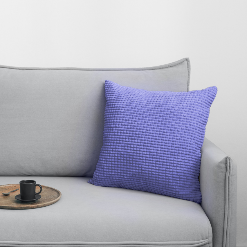
Pantone's Very Peri
The brand-new blue — a vivifying violet electric red undertones — boasts both constancy and energy, consistency and excitement. The best part about this bold hue is that it encourages creativity and expression, so maybe an out-of-the-box change is in order.
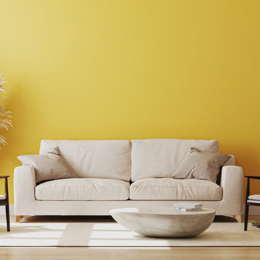
Babouche
In 2022, we’ll relish brighter colors that herald a return to normality. The sunny and uncomplicated Babouche is perfect for embracing this - whilst bold, it never feels garish or overpowering. This shade of yellow can be described as ‘subdued sunshine.’ Despite its bold hue, it’s not overly bright or overpowering, making it perfect for a larger room, where its cheerfulness will intensify.
School House White
A soft, off-white shade of 'School House White' is designed to resemble white in a shaded area. Muted, timeless, and comfortably familiar, this shade evokes the nostalgia of old schools. This shade will also amplify the power of Babouche if you want to combine several 2022 color trends.
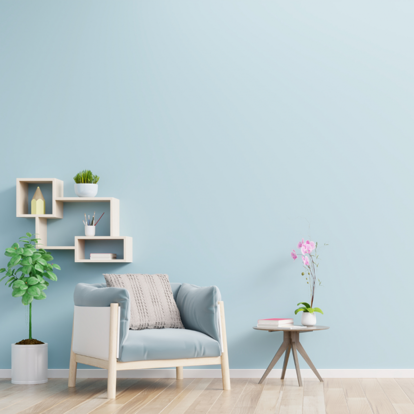
Bright Skies
This airy and fresh shade breathes new life into any space. It will be a game-changer when people use this tone on their ceilings. This hue is both uplifting and light, while simultaneously being soothing, familiar, and apt for a joyous safe haven. This shade has the potential to be the new grey, in a turn towards color with less emphasis on neutrals.
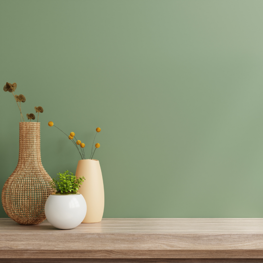
Breakfast Room Green
This shade complements plants, whether art-depicted, or real, and would work well to promote a sense of wellbeing within the home. Pair this shade with Stone Blue for a visual effect that is captivatingly familiar. Due to its calming nature, opt for artwork that speaks to wellbeing.
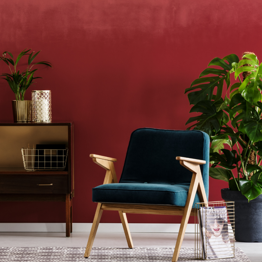
Incarnadine
This shade combines traditional red while beckoning the spirit of the leisurely Mediterranean. This shade would pair perfectly with warm woodwork and rustic gold touches. Alternatively, angle it towards an edgy twist by pairing it with a bright white shade.
October Mist
A soft grey-green, October Mist makes a great foundation color from which to build an earthy palette. Much like Breakfast Room Green, this shade encourages a reconnection with the great outdoors and is easy to introduce into your home. A particularly calming color combination puts October Mist with deeper fern greens.

Stone Blue
An appreciation of vintage style shows no sign of faltering in 2022, with the timeless Stone Blue by Farrow & Ball sitting alongside Dulux's Bright Skies as the most on-trend blue shades. This warm and timeless blue can be used alongside other warm hues to create an inviting, vintage look.